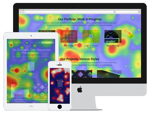
Analyse Visitor Behaviour Through Visual Graphics
One of the most useful ,powerful and real time data analysis tools to understand the relevance of content on a website within a few seconds .
ClickNurture Heat Map Features
Direct Overview of Performing Areas
The best part of Heat Maps is that it pulls direct attention to important matters of website. Through different clicking patterns, it redirects the most engaging content and visitors, tracks mouse movements and highlights major contributing territories. Heat map tool highlights the most and lowest performing areas on the website.
Improves User Experience
Every click represents the interest of visitors on website products and/or services. Heatmap filters can show how different your audience reacts to the same content and right analysis to a specific audience lets you offer them a better experience. By stating the gap in the high and low performing content, heat map graph is well recommended by marketeers for best results.
Easy to Analyse
The visual coloured representation makes it easier to analyse and interpret. It helps you identify problems in your website by simply tracking your users’ activity and giving you a glimpse of their behaviour. A sure shot way to optimise your website in a better way.Heat mapping tool is easy to embed, monitor and analyse across different industries.
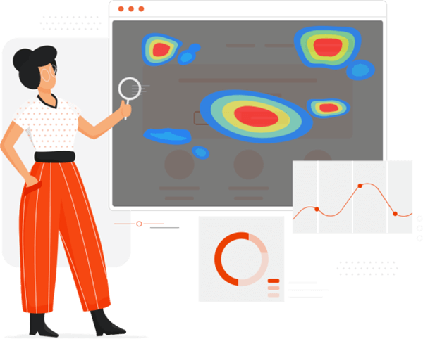
Features of Heat Map
Instant Overview
Heat Maps tell you at a glance what’s working and what needs to be addressed.
Visual Approach
Heat Map graphics offer undeniable advantages over other analytical tools.
Easy to learn
Multi-colored splotches, dispersed clicks, or cold spots above links offer the answer you seek in a simpler manner.
Easy to integrate
Heat Maps are unique and work best when combined with others.
Better user experience
By vesting interest in knowing how visitors react to particular content on a website helps to dig in to strategies to improvise the same.
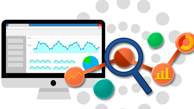
Diagnostic tool
Heat Maps as a web diagnostic tool add significant speed to the problem-solver’s journey.
Easy Setup Get started in 30 seconds
ClickNurture Gives powerfull tool for analytics

Signup with ClickNurture
Easy Signup process with four different pricing packages. Begin with one which suitable for you

Set pages on tracking
Set pages you want on tracking for analytics reports.

View Reports
Analyse the changes on all in one panel and witness the difference.